
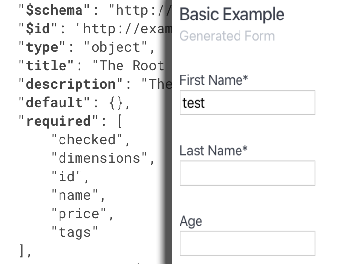
react-schema-form was build to simplify the management of HTML forms. It’s based on React and JSON schema. By having the necessary knowledge of the data being manipulated, such as structure, data types, particular constraints or patterns, you can design JSON schemas which will serve as inputs for the forms which will be automatically generated. By using Ajv as a main dependency, the form data is also being validated on submit.
react-schema-form exports a React component, which supports the following properties: schema, wrapper, data, config, onSubmit, errorFormatter. Each of them will be detailed in the < SchemaForm /> props section.
Installation
Install the library via npm:
$ npm install --save @ascentcore/react-schema-form
The only peer dependency is React 16+.
Import the form component from the library:
import {
    SchemaForm
} from '@ascentcore/react-schema-form';
Quick Start
function BasicSchemaExample() {

    const onValid = (data) => {
        console.log(data)
    }

    const schema = {
        "type": "object",
        "title": "Person",
        "description": "Person Information",
        "required": ["fullName"],
        "properties": {
            "fullName": {
                "type": "string",
                "title": "Full Name"
            },
            "age": {
                "title": "Age",
                "type": "integer",
                "minimum": 10
            }
        }
    }

    const data = {
        fullName: 'Defined Value'
    }

    return (<SchemaForm schema={schema} onValid={onValid} data={data} />)
};
For more examples you can check the example folder of the library. To run them, execute the following instructions:
$ cd example
$ npm install
$ yarn start
< SchemaForm /> props
- schema property is mandatory and contains the json-schema used to render the form. It can be declared locally or imported from a json file. The schema has to respect some meta-schema standards, which are detailed in the Custom JSON meta-schema section.An example of schema usage, processing both data and errors, can be seen inside example/src/basic-schema folder.
- data is an optional property which receives the data with which the form will be pre-populated; both this data and the final data (after field updates) must respect the json-schema constraints.An example of data usage, processing both data and errors, can be seen inside example/src/basic-schema folder.
- onSubmit is an optional property which contains a callback function; the callback function will be called when the submit button was triggered. the callback accepts two paramerers(data, errors) => voiddata contains the data as it was submittederrors contains a list of validation errors (if any), as defined by the ajv library.An example of onSubmit usage, processing both data and errors, can be seen inside example/src/custom-wrapper folder.
- wrapper is an optional property which receives a React component which will be used as a wrapper for the html elements of the form. If not specified, the library uses a default one which displays the title of the component on top (marked as mandatory if it’s the case), and with the errors at the bottom. For more details, see the Customization section.An example of wrapper usage, processing both data and errors, can be seen inside example/src/custom-wrapper folder.
- errorFormatter is an optional property which accepts a function and has the behaviour of a pipeline, receiving an error object and returning the altered object.(error) => objecterror contains a validation errorreturned value is also a validation error which can be altered inside the functionAn example of wrapper usage, processing both data and errors, can be seen inside example/src/custom-error-messages folder.
- config is an optional property which supports the following
- registry – an optional object which can be defined to override the standard registry, meaning what component/wrapper will be rendered when specific registryKey will be encountered. It supports both component and wrapper overriding. The component can be either a component from the library, or a new component defined by the user. In the first case, the component will be given as a string. In the second case, the component will be given as a React Component. Our library’s existing components are detailed in the Form default elements. The wrapper, if specified, has to be a custom component. A case of usage can be wanting to use radio buttons instead of a select with options when encountering fields of type enum.
- exceptions – an optional object which can be defined to override the standard registry for a specific property key or path, meaning what component/wrapper will be rendered. Specific key means a property with a specific name at any nesting level. Specific path means a string with a pattern like this “.user/.age”, and it will match a single property of the json schema. The component can be either a component from the library, or a new component defined by the user. In the first case, the component will be given as a string. In the second case, the component will be given as a React Component. Our library’s existing components are detailed in the Form default elements. The wrapper, if specified, has to be a custom component. An example of config usage can be found inside example/src/custom-registry folder.
Form default elements
The default form elements are:
TextElement
an input of type text; will be rendered when schema property is of type string
"firstName": {
    "type": "string",
    "title": "First Name"
}
NumericElement
an input of type number which can be either float or integer; if the type of the json property is number => float; otherwise, if integer => integer
"age": {
    "type": "integer",
    "title": "Age"
}
CheckboxElement
an input of type checkbox which will be rendered when schema property is of type boolean
"agree": {
    "type": "boolean",
    "title": "Agree with Terms & Conditions"
}
SelectElement
a single selection element; it will be rendered if schema property has the enum field in it’s definition
"type": {
    "title": "Type",
    "type": "string",
    "enum": ["NW", "NE", "SW", "SE"]
}
If the key is not the same with the selected value, the options field can be passed instead of the enum one, giving a key value pair type of objects as a list. The label for the key and the value can also be specified as fields on the same property. The fields’ names are: labelKey and valueKey. If not specified, the default names for them will be ‘labelKey’ and ‘valueKey’.
schema.properties.type.options = [
    { key: 'key1', value: 'value1' },
    { key: 'key2', value: 'value2' },
    { key: 'key3', value: 'value3' },
    { key: 'key4', value: 'value4' }
]
schema.properties.type.labelKey = 'key'
schema.properties.type.valueKey = 'value'
RadioElement
a group of inputs of type radio; not used in standard registry, but by using a custom registry or a list of exceptions, the SelectElement can be overwritten with a RadioElement
"location": {
    "title": "Type",
    "type": "string",
    "enum": ["N", "E", "S", "W"]
}
MultipleSelectElement
a multiple seleciton element; it will be rendered if the json schema contains a property of type array with items of type string with the enum field present on them
"hobbies": {
    "title": "Hobbies",
    "type": "array",
    "items": {
        "title": "Hobby",
        "type": "string",
        "enum": ["singing", "drawing", "hiking", "snowboarding", "reading"]
    }
}
FileElement
an input of type file; it will be rendered if the json schema contains a property which has an contentMediaType or a contentEncoding field present in it’s definition;
"file": {
    "title": "Upload photo",
    "type": "string",
    "contentEncoding": "base64",
    "contentMediaType": "image/png, image/jpeg"
}
another way to render an input of type file is to add an extra field in the definition of a property of type object. The field will have the key “instanceof” and the value “file”. In this second case, the form will also store the filename of the uploaded file.
"profilePicture": {
    "title": "Upload photo",
    "type": "object",
    "instanceof": "file",
    "properties": {
        "filename": {
            "type": "string"
        },
        "content": {
            "type": "string",
            "contentEncoding": "base64",
            "contentMediaType": "image/png, image/jpeg"
        }
    }
}
Objects with nested properties can be defined either in place, via the properties field, or by using the definitions field and referring to it via refs field. In case of objects, a wrapper will be rendered, containing all the properties as individual elements inside of it.
When running across an array of items (if not an array of enums which results in a multiple select), the library will render each item by it’s type, adding after each of them a button with the scope of removing the item, and a button at the end of the array, for adding a new item in the list.
The buttons inside the application can be customized too. The registry has different entries for addButton, removeButton and the simple submit button. The classNames for the addButtons and removeButton are ‘ra-add-button’ and ‘ra-remove-button’.
You can read more about the registry in the Customization section.
Conditionals
The structure of the schema can be dynamically altered by specifying if conditions at the same level with the properties keyword. The conditionals support multiple properties with a any number of nesting levels under an if condition, or under multiple if conditions (declared with allOf oneOf or anyOf). The structure of a conditional schema is the following:
{
  "type": "object",
  "properties": {

    "street_address": {
      "type": "string"
    },
    "country": {
      "enum": ["United States of America", "Canada"]
    }

  },
  "if": {

    "properties": {
        "country": {
            "const": "United States of America"
        }
    }

  },
  "then": {

    "properties": {
        "postal_code": {
            "type": "string",
            "pattern": "[0-9]{5}(-[0-9]{4})?"
        }
    }

  },
  "else": {

    "properties": {
        "postal_code": {
            "type": "string",
            "pattern": "[A-Z][0-9][A-Z] [0-9][A-Z][0-9]"
        }
    }

  }
}
Under the if statement a set of properties have to be defined containing at the highest nesting level a const attribute. The then/else attributes can define subschemas with one or more levels of nesting that will be added to the base schema if the value of the data field is matching the if statement. The properties can be added or only altered. The else statement is not mandatory.
To define multiple if statements, the following structure will be followed.
{
  "allOf": [

    {
      "if": { ... },
      "then": { ... }
    },
    {
      "if": { ... },
      "then": { ... }
    }

  ]
}
When defining multiple properties under the same if statement, the resulted condition will be formed by inserting the logical AND ( && ) between them. If the user wants a condition which uses the logical OR ( || ), they have to be declared sepparately inside an allOf attribute.
When the data changes and is no longer matching the condition, the properties which will disappear, will be also stripped off from the data object.
If the effects of two conditions are overlapping, the last one will overwrite the others.
The library is implemented according to ajv’s default behavior. When the properties specified as part of a conditional if statement are not present at all on the data object, the condition will be evaluated as being true, meaning that the “then” statement will be applied. To avoid this behavior, the user can define default values for the properties.
Customization
Registry customization – the registry of the library has the following form
enum: { component: ..., wrapper: ... },
multipleEnum: { component: ..., wrapper: ... },
boolean: { component: ..., wrapper: ... },
number: { component: ..., wrapper: ... },
integer: { component: ..., wrapper: ... },
string: { component: ..., wrapper: ... },
file: { component: ..., wrapper: ... },
button: { component: ..., wrapper: ... },
addButton: { component: ..., wrapper: ... },
removeButton: { component: ..., wrapper: ... }
In order to change the default behavior, the user has to pass a config object to the SchemaForm, containing either a custom registry or a list of exceptions.
When receiving a custom registry, the SchemaForm will replace all the default components for some given registryKeys with the specified ones. In the same way, the wrapper will be replaced if specified.
const customRegistry = {
    integer: { component: CustomNumericField, wrapper: CustomWrapper },
    enum: {component: 'RadioElement'},
    addButton: { component: CustomAddButton, wrapper: CustomWrapper }
}

return (
    <SchemaForm
        schema={schema}
        onValid={onValid}
        data={data}
        config={{ registry: customRegistry }}/>
)
Specifying the component or the wrapper are both optional. If not specified, the component will be the default one. If not specified, the wrapper will be the custom one (if specified) or the default one. The component can be either a custom one defined by the user or a default one, reffered to as a string. The possibilities are: ‘TextElement’, ‘FileElement’, ‘NumericElement’, ‘SelectElement’, ‘CheckboxElement’, ‘ButtonElement’, ‘RadioElement’, ‘MultipleSelectElement’
When receiving an exception object, the SchemaForm will prioritise the rules listed in it. For example, even though the enums are replaced with radio elements by using a custom registry, if a key listed among the exceptions happens to be of type enum, it will be rendered with the specifications listed in the exception object, not the ones from the custom registry.
The exception object supports both keys and paths. The key rule applies at any nesting level while the path rule applies only to one specific path (full path is required). Path exception has priority over the key exception. When considering key exceptions, the property name will be specified (e.g. ‘age’). For path exceptions, the path will be specified in the following form: ‘.user/.age’.
const exceptions = {
    keys: {
        'gender': { component: 'SelectElement' }
    }
}

return (
    <SchemaForm
        schema={schema}
        onValid={onValid}
        data={data}
        config={{ exceptions: exceptions }}
    />
)
The custom registry also makes it possible for the user to add server calls while designing a component. A useful example is under the example/src/ajax-call-schema where a lookahead inside a searchbar is simulated.
Wrapper customization – the default wrapper is a container containing the title of the property, the component itself and the error message. The className of the wrapper depends on the type of the property. If the property is of type array or object, the className will be ‘ra-elem-instance’. Otherwise it will be ‘ra-elem-wrapper’. The className will also contain ‘ra-elem-‘ followed by the type of the property and ‘ra-error’ in case of error.
function CustomWrapper({ property, children }) {
return (<div>
    <div><b>{property.title}</b></div>
    {children}
</div>)
}

export default function CustomWrapperExample() {

    return (<SchemaForm schema={schema} wrapper={CustomWrapper} />)

}
Error formatter – the errors handled by the library are the following: minimum, maximum, exclusive minimum and exclusive maximum for numbers/integers, minimum length, maximum length and patterns for strings, and minimum items and unique items for arrays. There is also a required constrained which works for each type of property.
If the user wants to customize the error messages, he can pass an errorFormatter property to the SchemaForm. The errorFormatter will work as a pipe, receiving the error object and returning an altered error object.
const formatError = (err) => {
    err.message = `Keyword: ${err.keyword}`
    return err
}

return (<SchemaForm schema={schema} errorFormatter={formatError} />)
The error object is the ajv ValidationError, having the following structure: keyword, dataPath, schemaPath, params, message, schema, parentSchema, data. The message field is the one that is displayed by the default wrapper.
Custom JSON meta-schema
The library uses a custom meta-schema to validate the given schemas by the user. The meta-schema is derived from the json-schema draft-07 schema, with some restrictions and a couple of custom fields.
- Our meta-schema currently supports just base64 encodings used for file uploads
- The items in an array can be of a single type, not multiple types
- The following fields are currently ignored: readOnly, writeOnly, examples, contains, maxProperties, minProperties, patternProperties, dependencies, propertyNames, not.
- The keywords allOf, anyOf, oneOf are currently taken into consideration only if they include if statements. See Conditionals section.
- instanceof field is a custom one. At the moment the supported value is “file”. In this case, the parent property has to be an object, and the schema must also contain the fields filename and content.
- options is another custom field. If the field is present, the library will render a select, taking the options from the given list. If not specified the name of the key and the name of the value attributes, will be ‘labelKey’ and ‘labelValue’. Otherwise, the names will be taken from the attributes. For more details see the Form default elements, the SelectElement section.

Written by
Corina
Corina is a Senior Fullstack engineer as part of the AscentCore Frontend Development team