The idea behind data visualization is more than just throwing data into a graph. To create meaningful data visualizations that capture attention and are easy to read and highlight the information we want, we need to design it to tell a story. Storytelling with data visualization creates an impact by turning vast amounts of data into easy to understand visualizations. Data visualization should expose hidden insights, patterns or relationships in the data and capture, compress and expose the very essence.
The code for the visualization is available at the following ObservableHQ Link
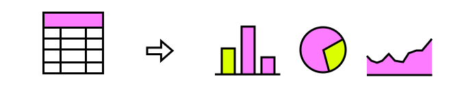
The usage of simple classic plots and charts applies when the number of dimensions to explore is reduced (e.g., income over the years, categories counts etc.). However, with large volumes of data and dimensions, creating balanced visualizations can be a real challenge.
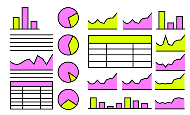
Dashboards are an excellent example of a failed attempt to capture as much information as possible in a meaningful way and allow the user to pick a thread to explore. Usually, all dashboards cram all visuals into the available space resulting in unreadable chaos hard to follow.
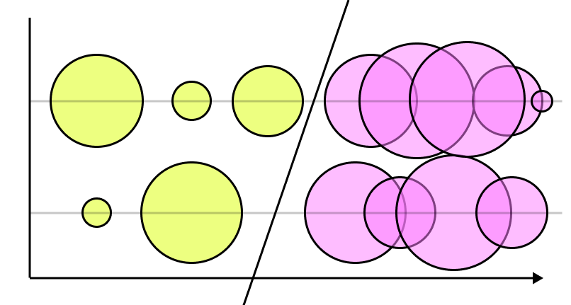
Another error in creating data visualizations is not taking into account the dynamicity of the data. As a result, the visualization can easily fall under traps such as lack of data and disproportionate scale factors, thus resulting in a boring storyless visualization.
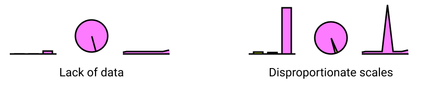
Both examples above are equally dull, but both of them might hide some relevant information. For example, the lack of data samples should expose the moment when data started to be captured and its volume instead of comparing with potential previous values. At the same time, the disproportionate scales might focus on a single outlier instead of capturing a generic trend. Both traps should be taken into account at the same time when designing the visualization.
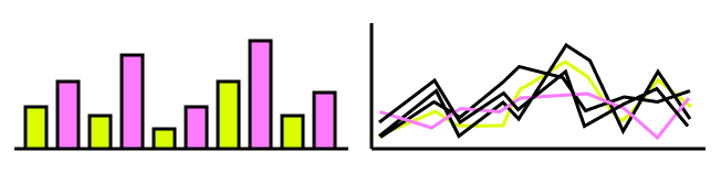
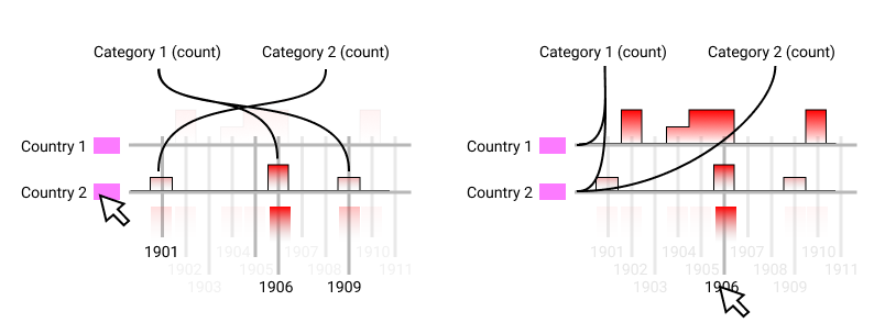
Another big trap when using classic representations is the impossibility of exposing an overview of the data due to a single visualization’s large amount of space. This trap will not allow the user to pick an exploratory thread in understanding the information behind the data.
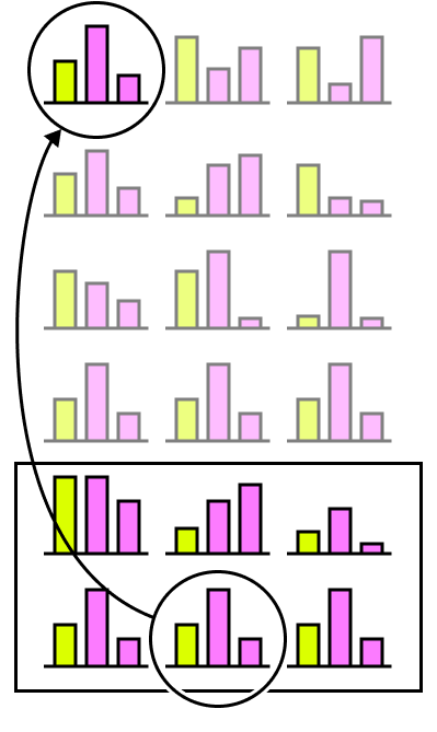
The example above exemplifies how one can miss an essential similarity between two different groups just because they were not both displayed in the user viewport at the same time. One traditional way to avoid this pitfall is to put all the representations in the same visualization and hope that the data varies enough to create a non-linear, various, not overlapping representation.
Examples of cluttering and hidden patterns
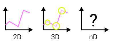
An excellent way to start is to pick the most meaningful dimensions that need to be captured in the representation. All classic representations can easily plot 2D or 3D dimensions for multiple groups without worrying too much about cluttering. This step can be achieved by calculating the value distribution over each column and seeing what columns have the most distinctive groups that can be used to start exploring the data. Identifying multiple user interest groups to begin exploring the data is the first step in creating a tailored custom visualization.
Use Case
This article will explore a simple multidimensional case: Nobel Prize Laureates Dataset to better understand the train of thoughts for creating visualizations. The dataset consists of 968 Nobel Prize winners with other information about the individual and the field of study. In addition, the selected use case introduces another level of complexity by having a hierarchical store of data for each row instead of being represented in a linear, tabular way.
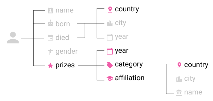
For creating an exploratory view of the dataset, there is no point in focusing on a specific individual but more on the categories with lower data distribution and the relationship between them:
- Years – The list of years when the prizes were nominated
- Countries – Three categories of information can be taken into account: birth, death or country of the institution that the laureate is associated with
- Category – The category of the Nobel Prize
- Affiliation – If the laureate is associated with an institution, then the affiliated institution name will be accompanied by the city and the country
- For each of these clusters, the number of prizes per group can be computed and taken into account as a new dimension.
Planning The Visualization
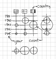
Sketching is essential when designing a visualization to get an idea of what the end representation will look like and how all components are displayed. The selected use case will try to represent multiple dimensions such as:
- yearly prize count
- prize count for each country
- prize count for each country per year
- prize count per category per year
- prize count per category per country
The initial choice was to represent the years vertically and countries horizontally to benefit from page scroll and the number of prizes per category represented with a circle.
The actual representation of the decision revealed two major mistakes for the initial decision:
- The lack of a clean overview due to the necessity of scrolling on small screen devices.
- Heavy cluttering of count numbers for countries with a high number of prizes for consecutive years
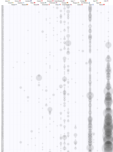
Rotating the visualization 90 degrees to counterclockwise offered another whitespace at the top where the categories could be fitted to represent the number of prizes/categories. Fitting a long timeline over the entire horizontal width was a real challenge and a decision was to make between making a scrollable timeline so that the user can focus on a timeline segment or use a three rows layout with negative offset representation for each year to make better use of the horizontal space. Ideally both options can be used and the decision can be made based on the available width to satisfy a larger number of screen sizes.
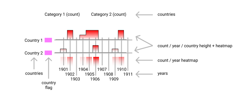
This representation allowed the user to have a better overview of the number of prizes by each country every year. For example, analyzing only the count/year heatmap every year exposed the fact that between 1940-1942 no Nobel prize was awarded and the number is increasing starting with 1973.
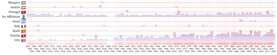
User interaction with each dimension was introduced to allow the user to explore a single dimension, so a high contrast was generated between values of interest and the rest. Furthermore, the interaction was introduced for country and years, and a path from category to year or country respectively was traced to visualize the awarded category.
Conclusion
Creating compelling visualizations through storytelling is the main goal in translating information into a visual context. When working with large data sets, the visualizations expose hidden insights, patterns or relationships in the data and at the same time capture, compress and expose the very essence.
Visualization is central to advanced analytics for similar reasons. For example, when a data scientist is writing advanced predictive analytics or machine learning algorithms, it becomes essential to visualize the outputs to monitor results and ensure that models perform as intended.If your business is ready to start a data analytics journey, reach out to AscentCore today. We build world-class digital products and transform, enrich, contextualize, and visualize your raw data to drive actionable insights.